
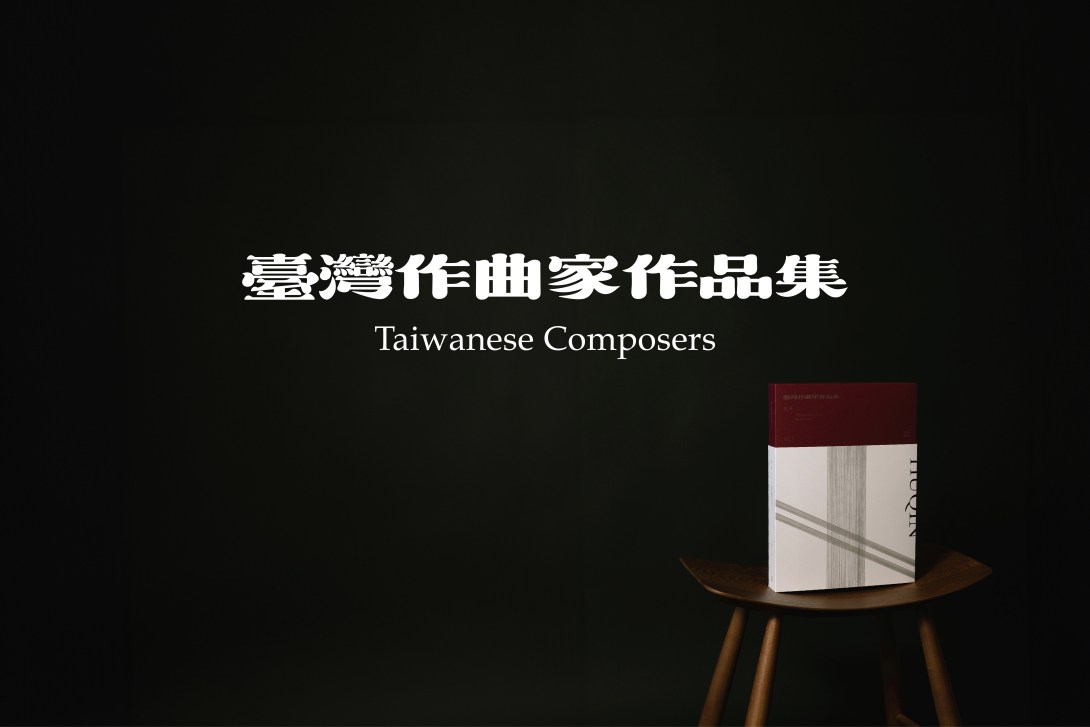
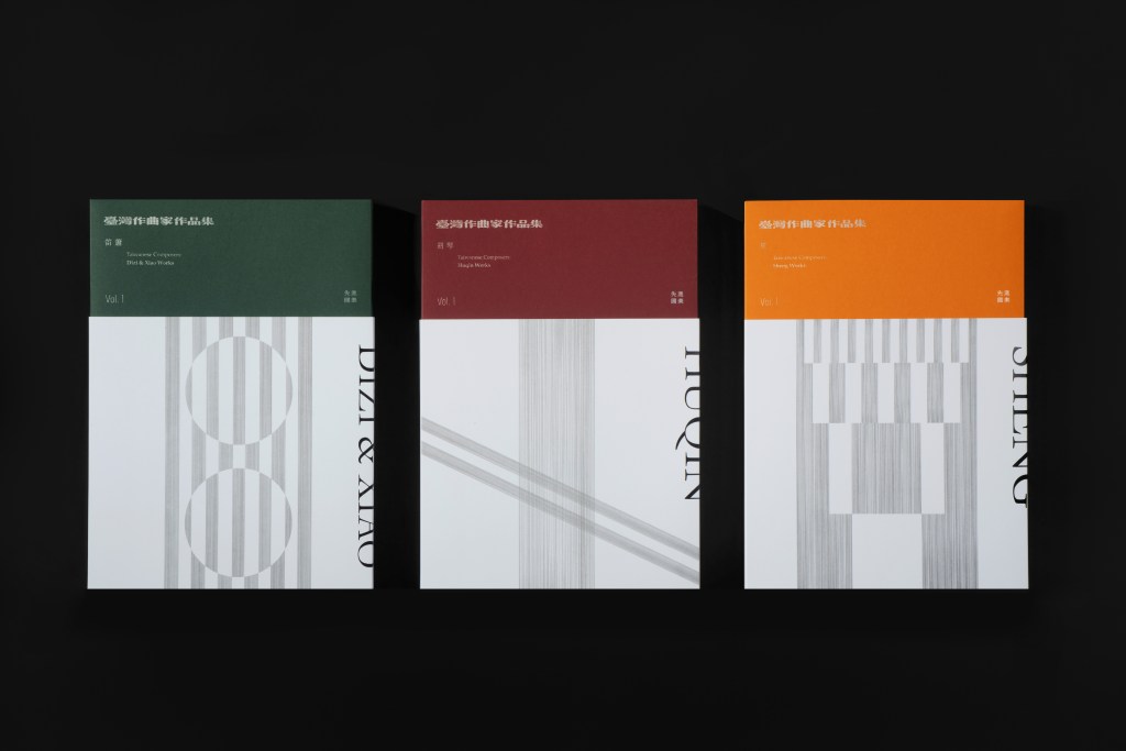
本作品係以臺灣青年作曲家國樂樂譜為主題的系列套書,嘗試回應國樂樂譜長期偏重功能排版、缺乏整體視覺語言與文化轉譯的問題。設計策略採極簡基調,透過手繪線條與沉穩色彩,對應各種傳統樂器的形貌與音質特色,轉化為視覺語言;細線象徵聲響在空氣中的運動關係,並進一步延展為面,形成對樂器形貌與音色的視覺表現,成為貫穿整體系列的重要元素。
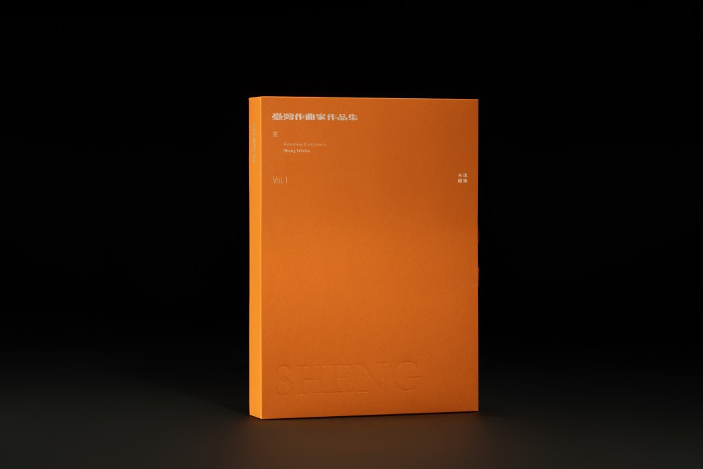
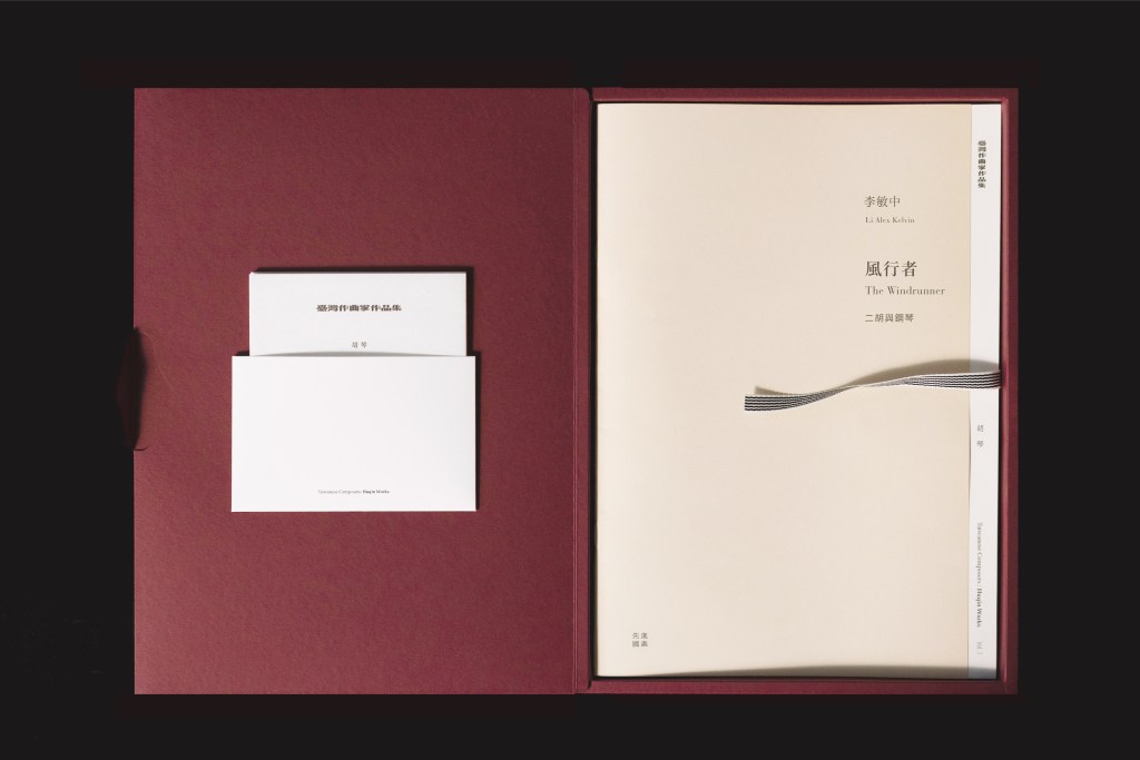
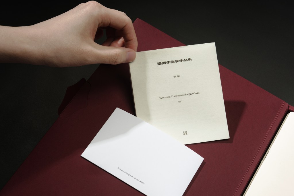
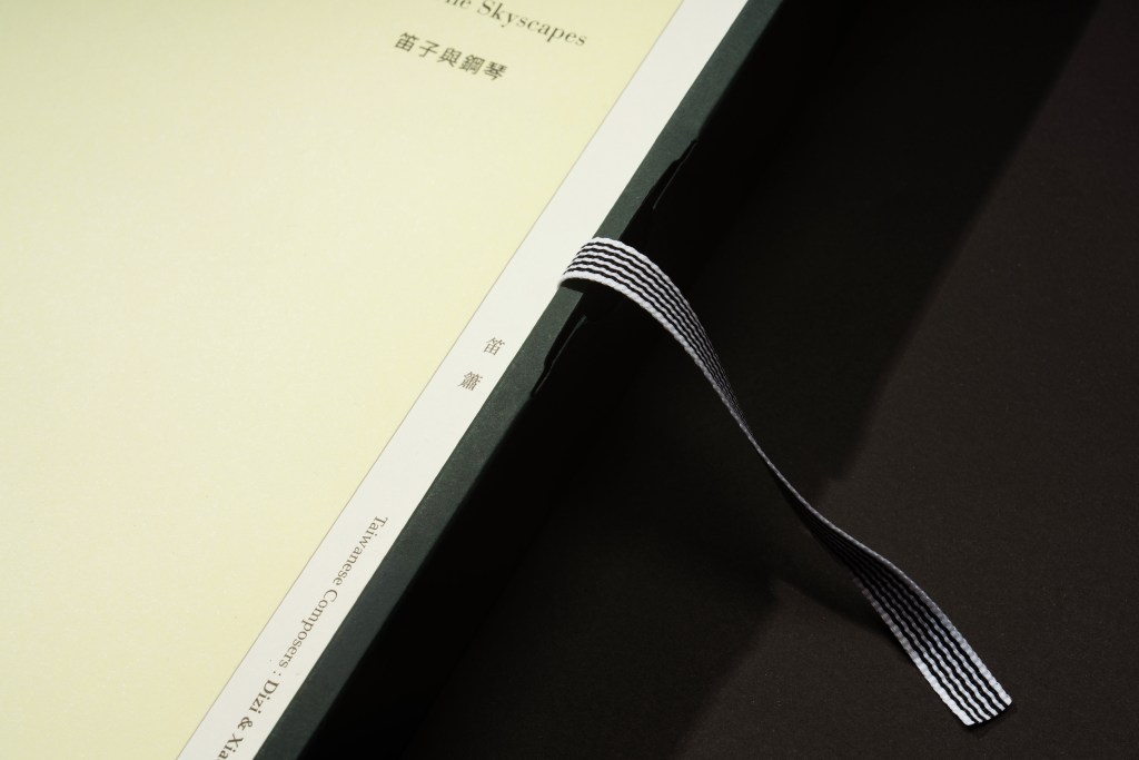
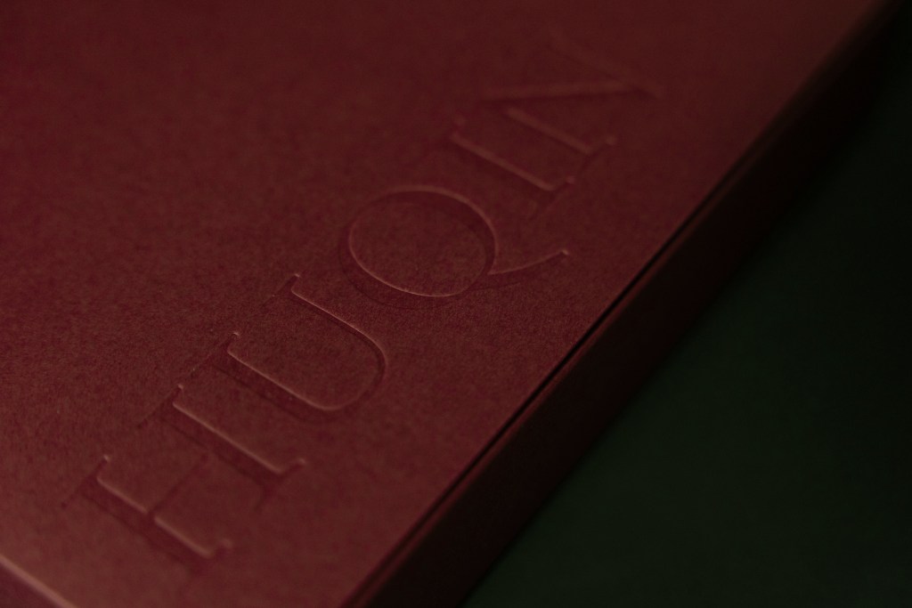
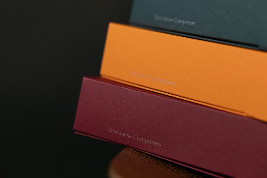
封面構圖隱含「T」字結構,既是 Taiwan 的首字母縮寫,亦作為系列延伸的視覺骨幹。在維持此結構的前提下,不同樂器版本將透過色彩與線條的變化對應各自音色與形態,建立具備一致性且可持續發展的視覺系統。裝幀結構層次分明,透過袖套、內封與盒裝的層遞關係,建立閱讀與開啟的節奏感。整體避開繁複裝飾,轉而強調紙張質地與印刷工藝的觸覺細節。
本設計將樂譜從單純的工具書提升至「文化物件」的高度,透過材質、結構與感官語言的整合,翻轉大眾對於傳統樂器的既定印象,為當代國樂出版品提出一種兼具實用機能與文化表達的出版典範。
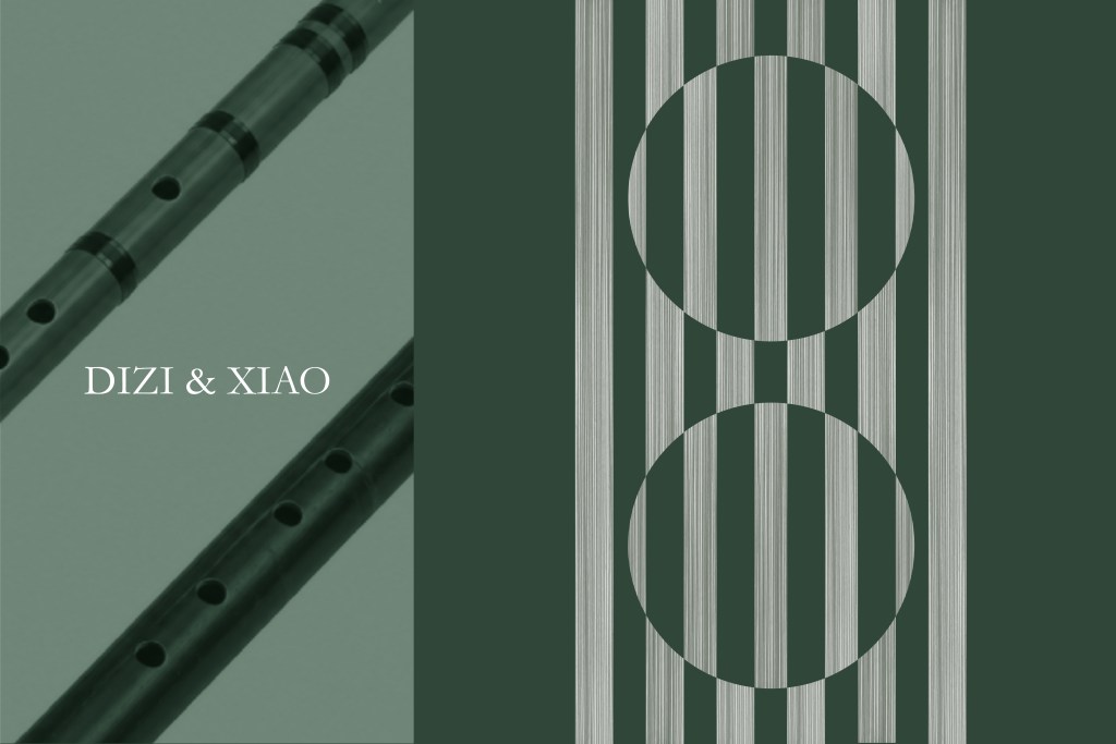
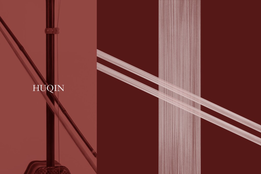
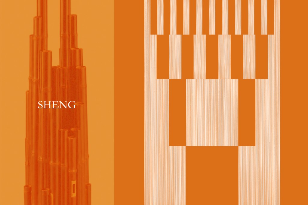
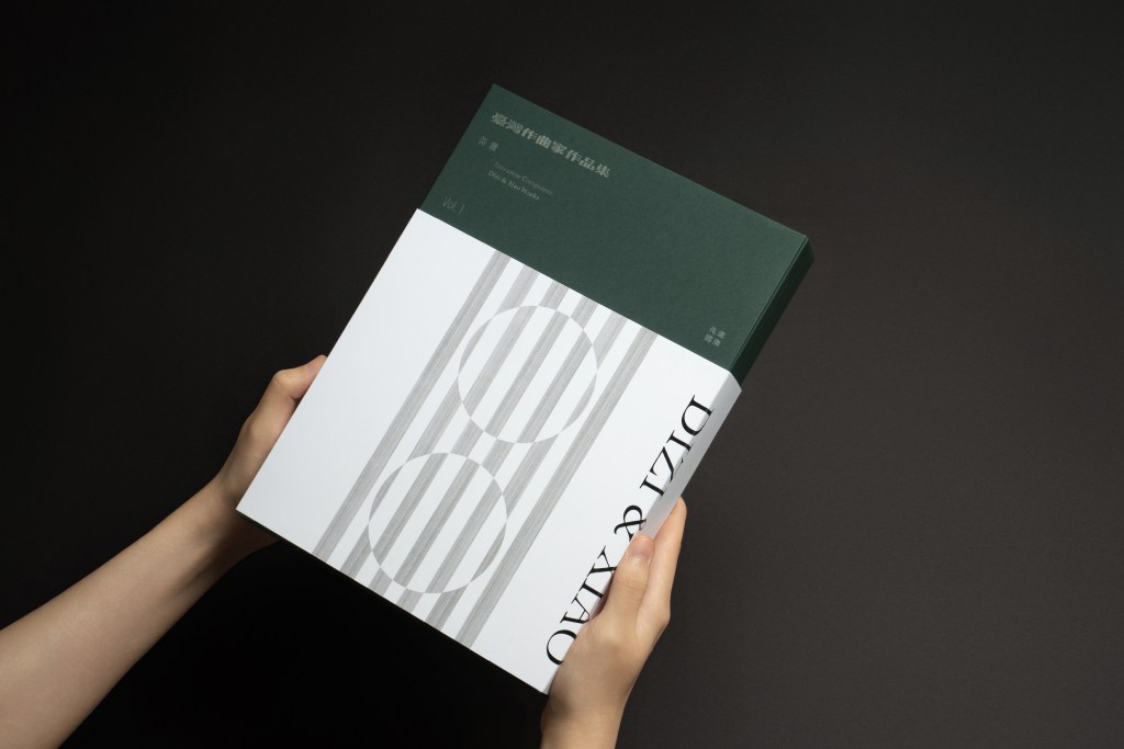
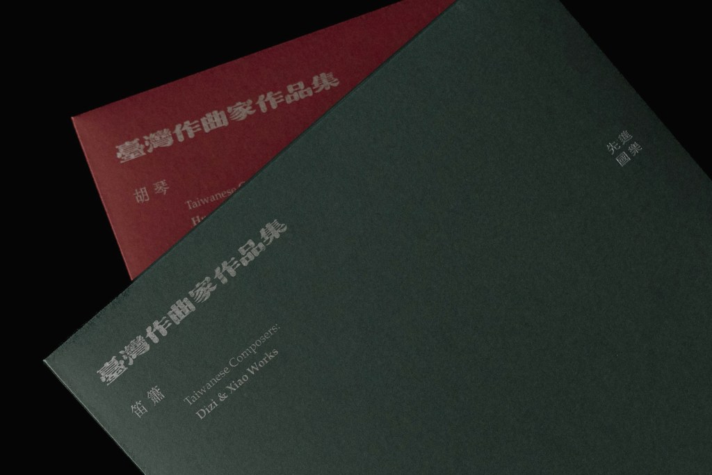
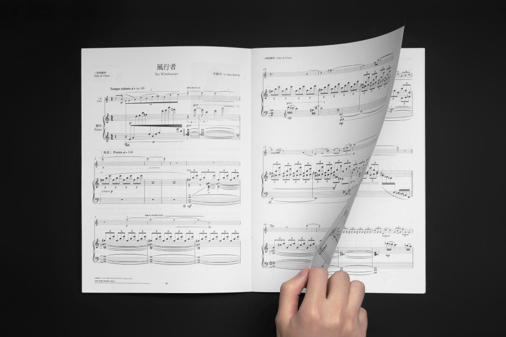
This work is a series of boxed sets centered on sheet music by young Taiwanese composers for traditional Chinese instruments. It responds to a longstanding issue in this field: layouts that prioritize functionality while lacking a cohesive visual language and cultural translation. The design strategy adopts a minimalist tone. Hand-drawn lines and subdued colors correspond to the timbral qualities and forms of different traditional instruments, transforming sound and shape into a visual language. Fine lines suggest the movement of sound through air; they are further expanded into planes, forming visual expressions of each instrument’s tone and morphology, and becoming a key element that runs through the entire series.
The cover composition subtly embeds a “T” structure—both the initial for “Taiwan” and a visual backbone for the series’ extensibility. While maintaining this structure, each instrument edition varies through color and linework to reflect its distinctive timbre and form, establishing a consistent yet sustainable visual system. The binding structure is clearly layered: through the sequential relationship of sleeve, inner cover, and box packaging, it creates a rhythm of reading and unboxing. Rather than relying on ornate decoration, the design emphasizes the tactile qualities of paper and the nuanced details of printing craftsmanship.
By elevating sheet music from a purely functional tool to a cultural object, this design integrates material, structure, and sensory language to overturn conventional impressions of traditional instruments. It proposes a model for contemporary publications on traditional Chinese music—one that balances practical function with cultural expression.
台湾の若手作曲家による伝統音楽の楽譜をテーマとしたシリーズブックデザイン。
従来の伝統音楽の楽譜は、機能性を重視したレイアウトが中心であり、統一されたビジュアル言語や文化的な翻訳が不足していた。本プロジェクトでは、その課題に対し、現代的な視点から新たな視覚表現を試みている。
デザインはミニマルな構成を基調とし、手描きの線と落ち着いた色彩によって、それぞれの伝統楽器が持つ形状や音色を視覚言語へと変換した。細い線は、空気中を伝わる音の軌跡を象徴しており、やがて面へと広がりながら、楽器の輪郭や音響的な質感を表現している。これらの線の構成は、シリーズ全体を貫く重要なビジュアル要素となっている。
表紙の構図には「T」の構造が組み込まれている。これは Taiwan の頭文字であると同時に、シリーズ展開を支える視覚的な骨格として機能している。共通構造を保ちながら、各楽器ごとに線や色彩を変化させることで、それぞれ異なる音色や造形的特徴に対応したデザインシステムを構築した。
装丁では、スリーブ、内表紙、ケースによるレイヤー構造を通して、開封や読書のリズムを設計している。装飾性は極力抑え、紙の質感や印刷加工による触覚的なディテールを重視した。
本プロジェクトは、楽譜を単なる機能的な書籍ではなく、「文化的プロダクト」として再定義する試みである。素材、構造、感覚的な表現を統合することで、伝統楽器に対する固定的なイメージを更新し、実用性と文化表現を両立した現代的な伝統音楽出版のあり方を提案している。
攝影|周昀叡+何浩宇、李旻中

