TC
南一書局一直站在臺灣主流教育體系的第一線。這不僅是一家出版社,更是陪著每一個世代長大的教育夥伴。在邁入 70 週年的關鍵時刻,面對少子化浪潮與數位閱讀趨勢對產業的衝擊,南一已從單一書局轉型為橫跨「教育出版、數位平台、多元智能」的全方位教育集團。此全新視覺識別系統正是為了回應時代變革而誕生。
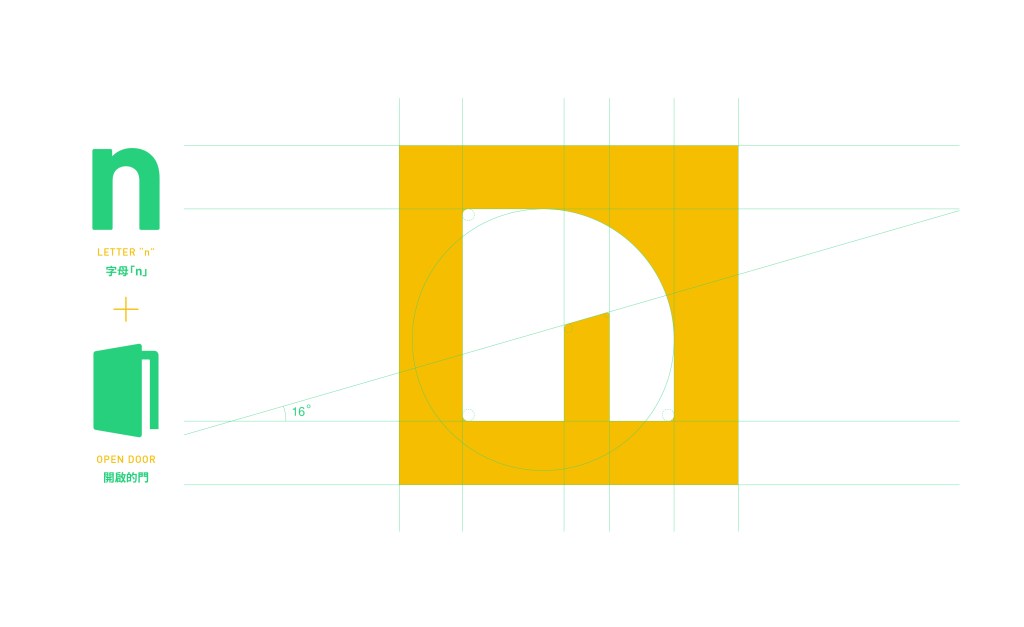
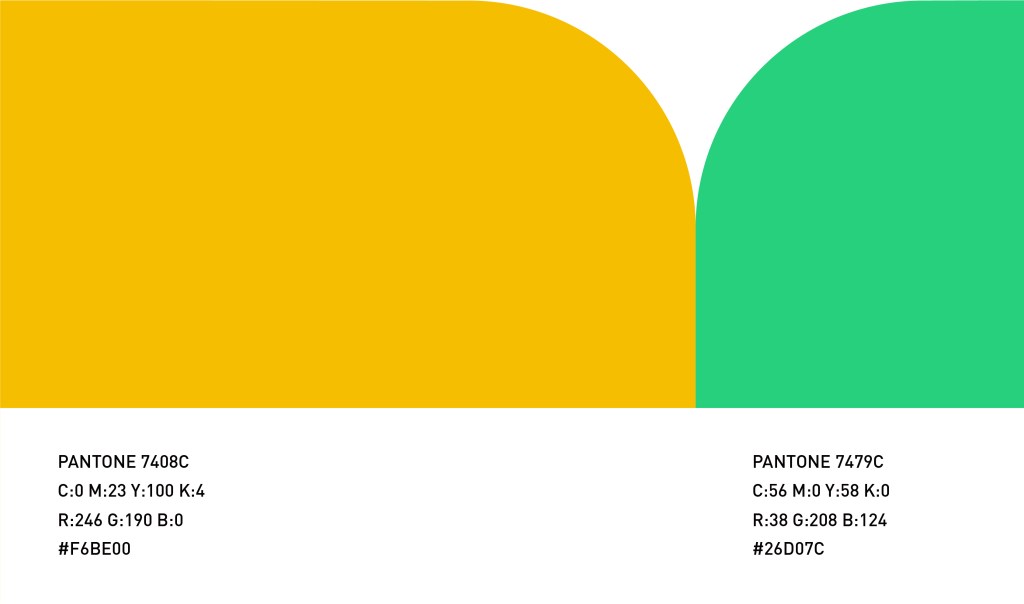
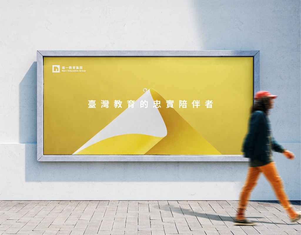
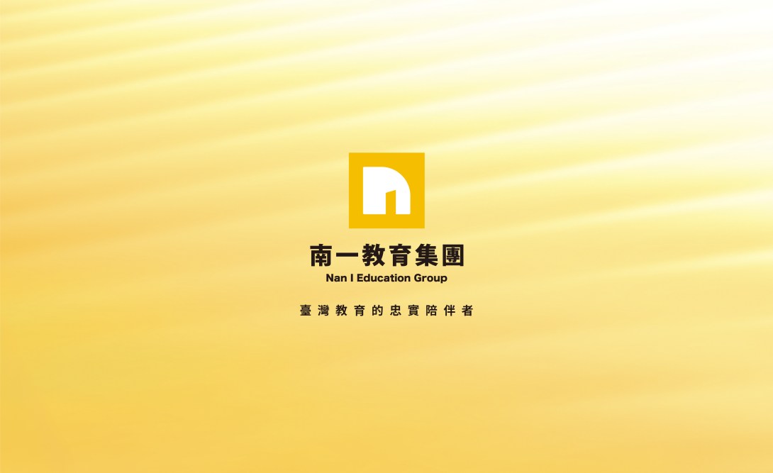
全新視覺識別系統承載著『臺灣教育的忠實陪伴者』之品牌精神,以簡潔且具高辨識度的設計,展現「穩健創新」與「多元共融」的核心價值,象徵南一在教育領域的長遠承諾與精進不輟。 在視覺表現上,標誌設計以字母「N」為核心,兼融「開放的大門」的意象,象徵南一作為學習的引路人,引領每位學子探索無限可能。方形結構則蘊含穩固與秩序,展現南一作為教育夥伴的專業與信賴感。 標誌主色調選用如晨曦般的金黃色,象徵知識的光輝與溫暖的陪伴,猶如一位可靠的導師,照耀並守護每位學子的成長之路。
此識別系統的建立,不僅彰顯了南一深厚的品牌底蘊,更將繼續陪伴每一位學子迎向未來,為臺灣教育開創全新的篇章。
EN
Nan I Book has long stood at the forefront of Taiwan’s mainstream education system. It is not merely a publishing house, but an educational partner that has grown alongside every generation. As it reaches the pivotal milestone of its 70th anniversary, and in the face of the declining birthrate and the rapid rise of digital reading trends impacting the industry, Nan I Book has transformed from a single publishing house into a comprehensive education group spanning educational publishing, digital platforms, and multiple intelligences. This new visual identity system was created in response to the changing times.
The new visual identity embodies the brand spirit of being “Taiwan’s faithful companion in education.” Through a clean and highly recognizable design, it conveys the core values of “steady innovation” and “diverse inclusion,” symbolizing Nan I’s long-term commitment to education and its relentless pursuit of excellence.
Visually, the logo centers on the letter “N,” integrating the imagery of an “open gateway,” symbolizing Nan Yi as a guide in learning—leading every student to explore limitless possibilities. The square structure represents stability and order, highlighting Nan Yi’s professionalism and trustworthiness as an educational partner. The primary color, a golden yellow reminiscent of the morning dawn, symbolizes the radiance of knowledge and the warmth of companionship—like a reliable mentor illuminating and safeguarding each student’s path of growth.
The establishment of this identity system not only demonstrates Nan Yi’s profound brand heritage, but also affirms its ongoing mission to accompany every learner into the future, opening a new chapter for education in Taiwan.
JP
南一書局は、これまで台湾の主流教育界の最前線に立ち続けてきました。 単なる出版社ではなく、あらゆる世代とともに歩んできた教育のパートナーでもあります。
創立70周年という重要な節目を迎えるにあたり、少子化の波やデジタル読書の進展による業界への影響に直面する中、南一は単一の出版社から「教育出版・デジタルプラットフォーム・多元知能」を横断する総合教育グループへと進化しました。本ビジュアル・アイデンティティは、まさに時代の変化に応えるために誕生したものです。
新たなビジュアル・アイデンティティは、「台湾教育に寄り添い続ける伴走者」というブランド精神を体現しています。簡潔で高い視認性を備えたデザインを通じて、「堅実な革新」と「多様性と共生」という中核的価値を表現し、教育分野における長期的なコミットメントと絶え間ない向上を象徴しています。
ビジュアル面では、ロゴはアルファベットの「N」を核とし、「開かれた門」のイメージを融合しています。これは、南一が学びの案内人として、すべての学習者を無限の可能性へと導く存在であることを象徴しています。
また、正方形の構造は安定と秩序を内包し、教育パートナーとしての専門性と信頼感を表しています。
メインカラーには朝日のようなゴールデンイエローを採用し、知の輝きと温かな寄り添いを象徴しています。それは、信頼できる指導者のように、学習者一人ひとりの成長の道を照らし、見守る存在を表現しています。
本アイデンティティの確立は、南一の深いブランドの歴史と価値を示すと同時に、これからもすべての学習者とともに未来へ歩み、台湾教育の新たな章を切り拓いていく決意を示すものです。

Animation|Tyson peng